Putting together a great outfit, redecorating a living room, or selecting binding tape to match a carpet all rely on good color matching, even if it doesn’t seem obvious at first. While good color choices often feel intuitive, there is real science behind combinations that look balanced and intentional.
The stakes are higher when working with permanent materials like carpet. But once you understand a few basic color principles, you can make color matching easier and avoid costly mistakes.
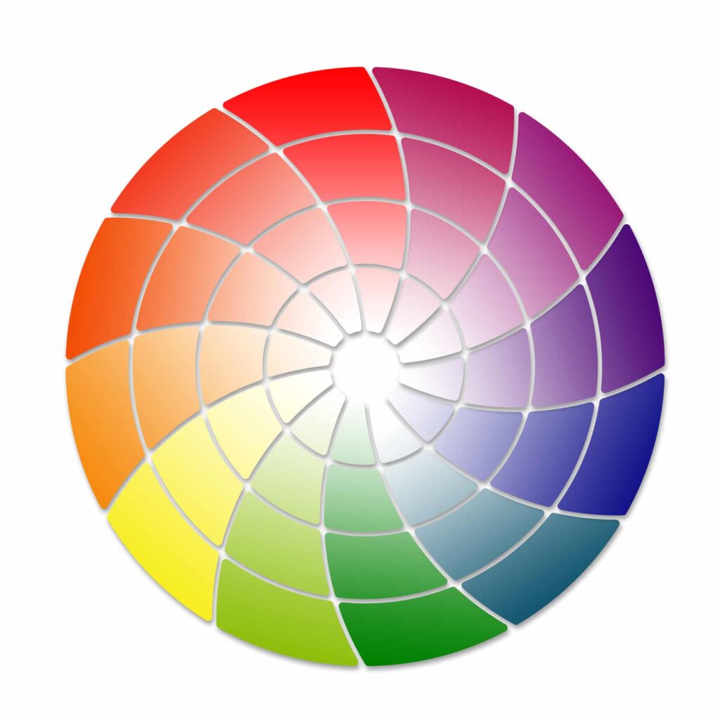
A Brief History of the Color Wheel
In the mid 1600s, Sir Isaac Newton passed white light through a prism and observed it separating into a spectrum of colors: red, orange, yellow, green, blue, indigo, and violet. He arranged these colors into a circular format based on how they appeared in the spectrum. While his theory linking colors to musical notes did not hold up, the color wheel itself did.
Understanding Primary, Secondary, and Tertiary Colors
The color wheel provides a simple framework for understanding how colors relate to one another. The modern color wheel breaks colors into three main groups.
- Primary colors include red, blue, and yellow. These colors cannot be created by mixing other colors.
- Secondary colors include green, purple, and orange. Mixing two primary colors creates each of these combinations.
- Tertiary colors form when you combine a primary color with a secondary color, such as blue green or red orange.
Knowing where colors sit on the wheel helps explain why some combinations feel natural while others clash. It also makes the wheel a practical tool for everyday color matching decisions.
How to Create Pleasing Color Combinations
Several proven approaches make color matching more reliable.
Primary colors create bold, eye-catching combinations. When used together, they provide a strong contrast that feels energetic without being chaotic.
Complementary colors offer another dependable strategy. These colors sit directly opposite each other on the color wheel. Blue pairs well with orange, red works with green, and yellow complements purple. These combinations stand out while still feeling balanced.
Color families provide a more subtle option. Shades within the same family, such as navy, denim, and cornflower blue, work well together. If an exact match is not available and you want differences to go unnoticed, staying within the same color family usually solves the problem.
Why Neutral and Earth Tones Work So Well
Earth tones and neutrals play an important supporting role in color matching. Colors like white, cream, gray, and tan pair easily with most hues because they appear naturally as background colors in nature.These tones rarely draw attention to themselves, which makes them especially useful when an exact match is not possible.
In carpet binding and trim applications, neutral colors often provide a clean, professional finish that does not compete with the carpet itself. They allow the carpet design to remain the focal point while still creating a finished edge.
Color Matching Is Harder When the Result Is Permanent
Some people develop a strong eye for color over time, while others find matching colors challenging no matter how much they practice. In clothing or décor, a mismatch is temporary. You can always change it later.
Carpet binding is different. Once installed, the choice becomes part of the finished product. A slight mismatch that felt acceptable at first can become obvious over time, especially in well lit spaces. That permanence makes careful color selection far more important.
How Lighting Affects Color Perception
Lighting conditions can dramatically affect how colors appear. Homes tend to use natural or warmer light, while commercial spaces rely more on fluorescent or mixed lighting. These differences can make the same color look noticeably different from one setting to the next.
Bond Products matches dyes under daylight conditions and uses a light box in the dye house to simulate different lighting environments. This process reveals how a single color can shift in tone depending on the light source. What looks like a perfect match under one type of light may appear noticeably different under another.
Why Color Cards Make Matching Easier
For this reason Bond Products offers a variety of color cards to our customers. We offer them for Instabind, carpet fringe, binding tape, serging yarn, and many other products. If you’d like to take the guessing out of color matching your binding tape to your carpet or rug, these cards are perfect. Make your color selection process as seamless as possible, and order your color cards today.